
Explore the form builder
Tabs
Once you’ve created an online form, you can access the form builder to customize it for gathering information.
Introduce the form builder
The form builder consists of:
-
Top Action Buttons
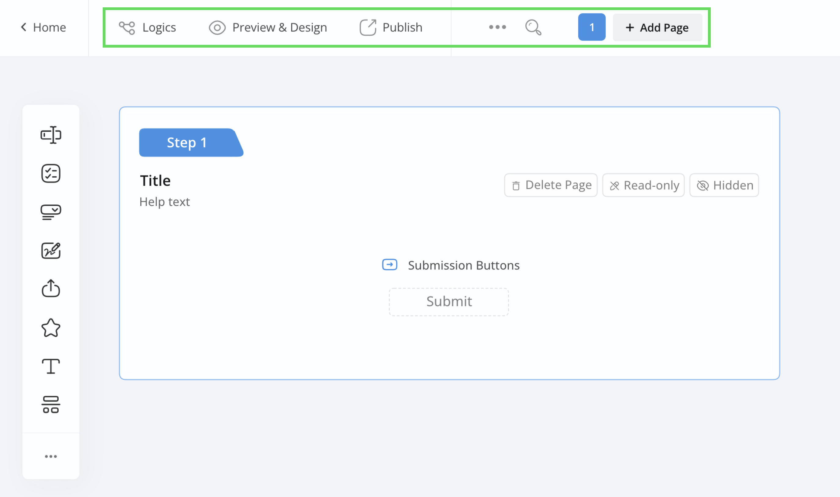
These buttons assist you in performing key actions such as adding logic, previewing, sharing, and adjusting settings. You can also use the search bar to find stuff quickly.
-
Far left Toolbar
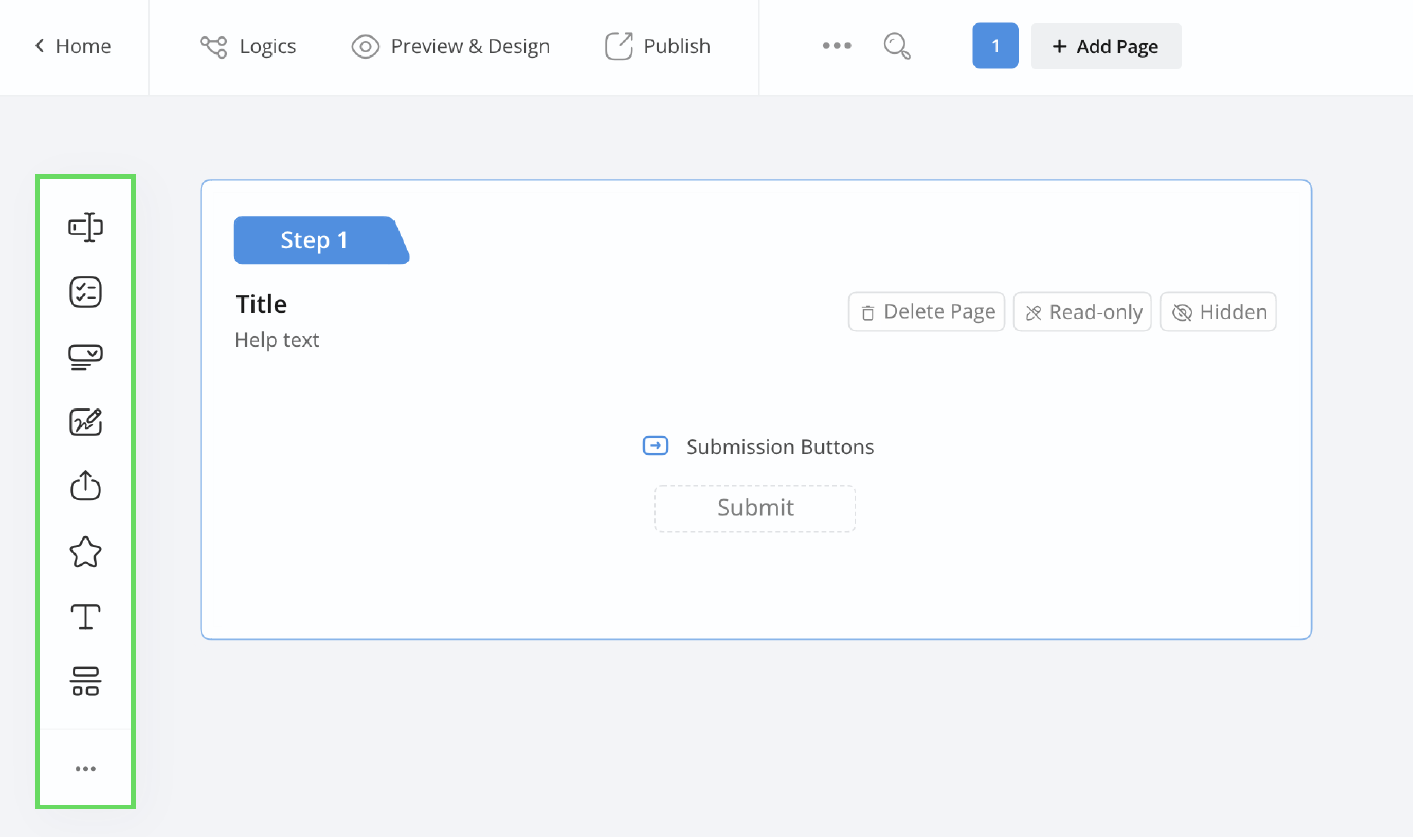
Choose various field types to add to your form.
-
Left Field Panel
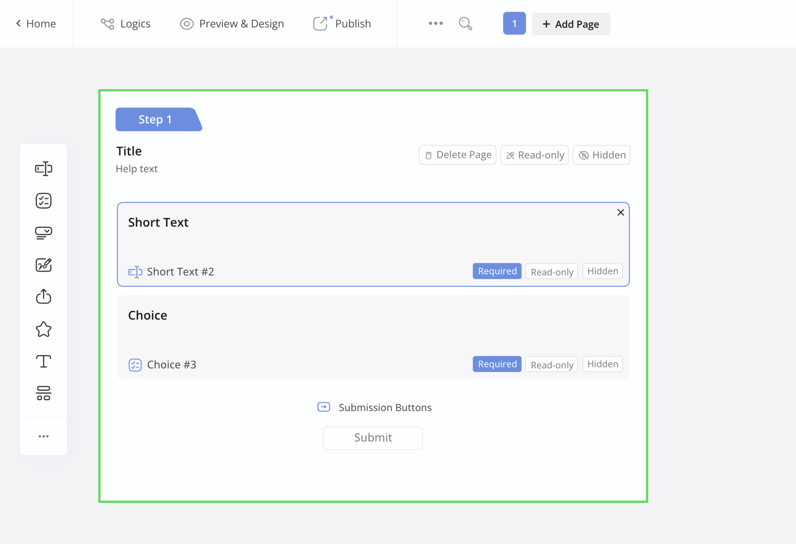
Customize each field and how it works.
Action Buttons

In the top left corner of the form builder, you’ll see action buttons that perform the following functions:
Main Functions
- Logics: Create conditions and rules to automate actions when respondents fill out the form.
- Preview & Design: Check how your form looks and customize its appearance.
- Publish: Make your form available for sharing when it’s ready for submissions.
More Functions
Next to the “Main Functions” buttons, you’ll find a small ••• icon. Clicking this icon opens a dropdown menu with various form settings options, including:
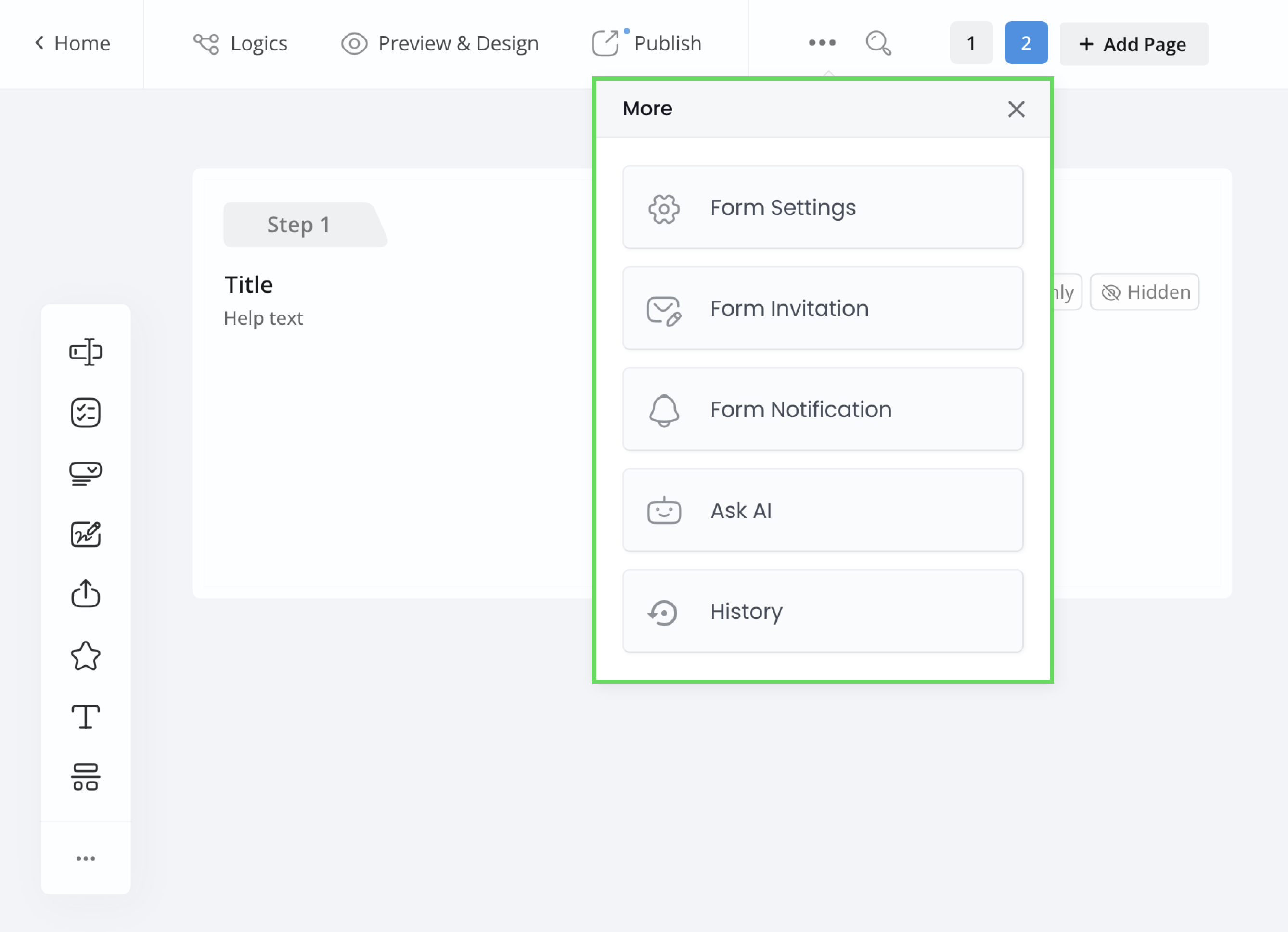
-
Form Settings
Configure form-related options like submission messages and languages.
-
Form Invitation
Customize form submission invitations.
-
Form Notification
Personalize email notifications for form submissions.
-
History
Track previous form versions and revert to them if needed.
To build or change your form with AI, use the Ask AI to build your form box at the bottom of the builder. See AI Form Generator.
Search Box
Currently, you can use the search box to quickly locate a field by entering its label or ID.

Add and navigate pages
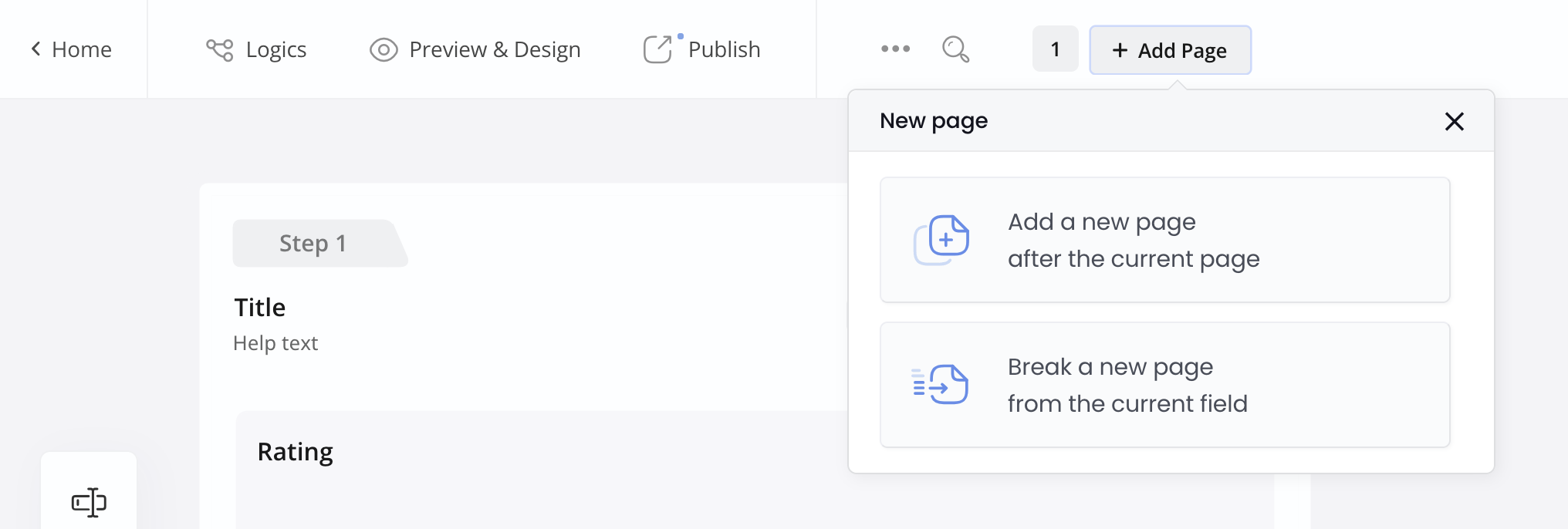
The Add Page button lets you manage form pages:
- Add a new page: Adds a new, independent page after the current page.
- Break a new page: Splits the form into a new page from the current field onward.
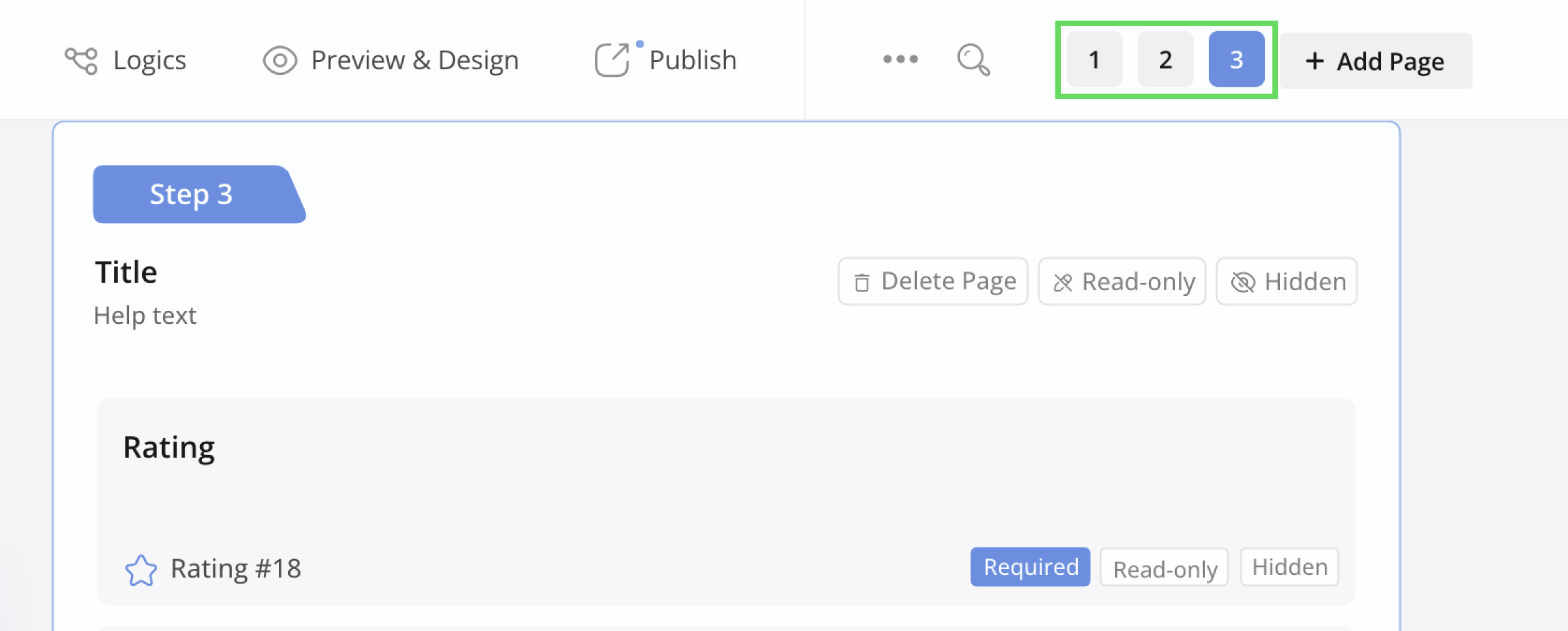
For forms with multiple pages, use the Page Toggle to switch between pages.
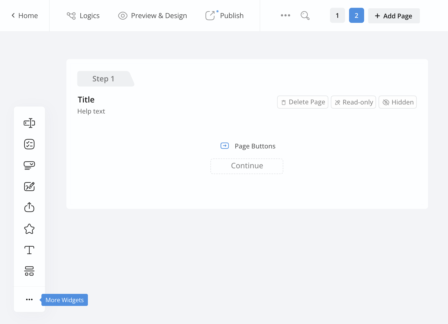
Toolbar
The Toolbar includes frequently used form fields like Text Input and Dropdown. Click the ••• icon to see additional fields.
Field Panel
In the left Field panel, you have several options:
Rearrange fields
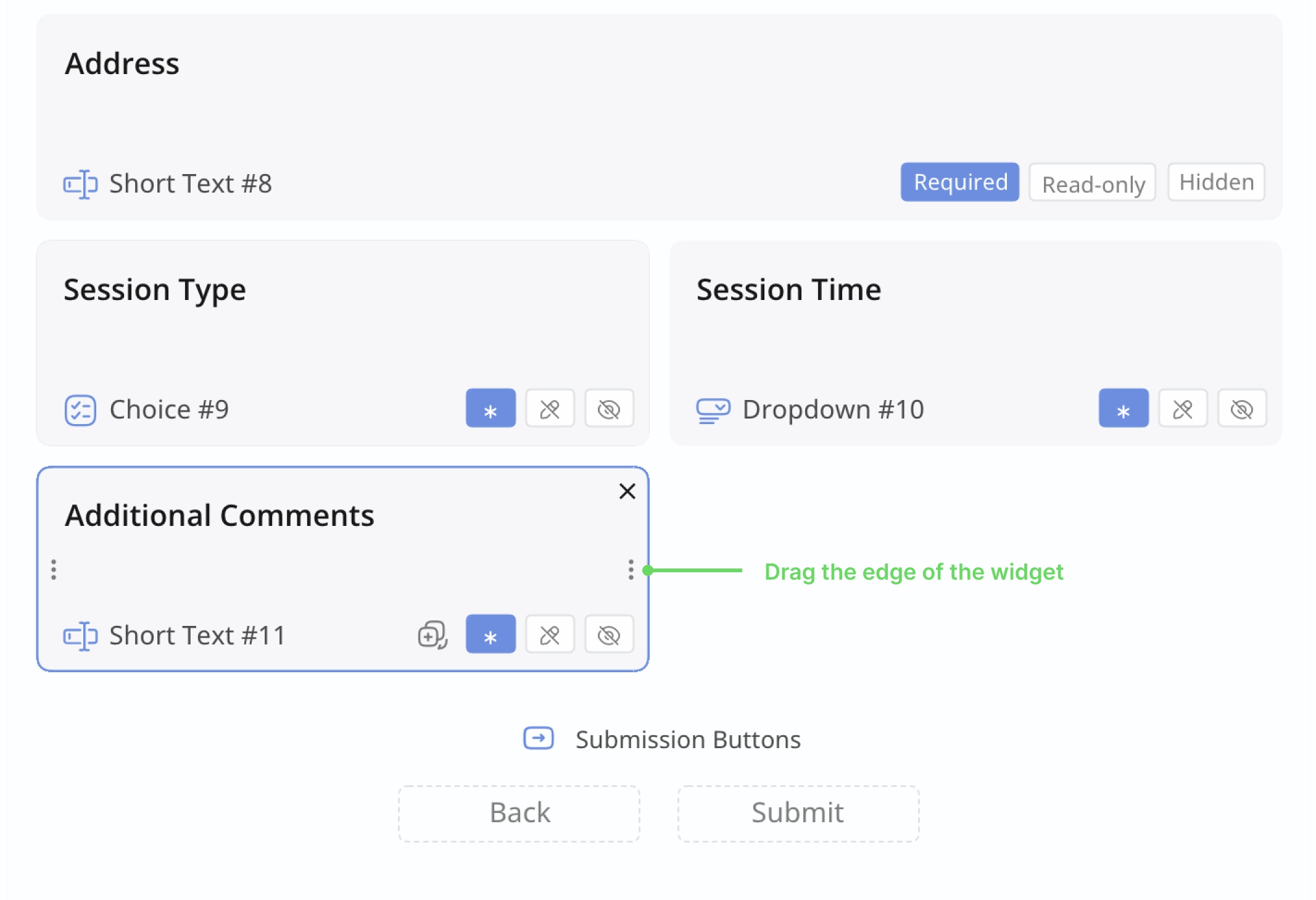
Change the order of fields by dragging and dropping them. This affects the sequence of fields on the online form.
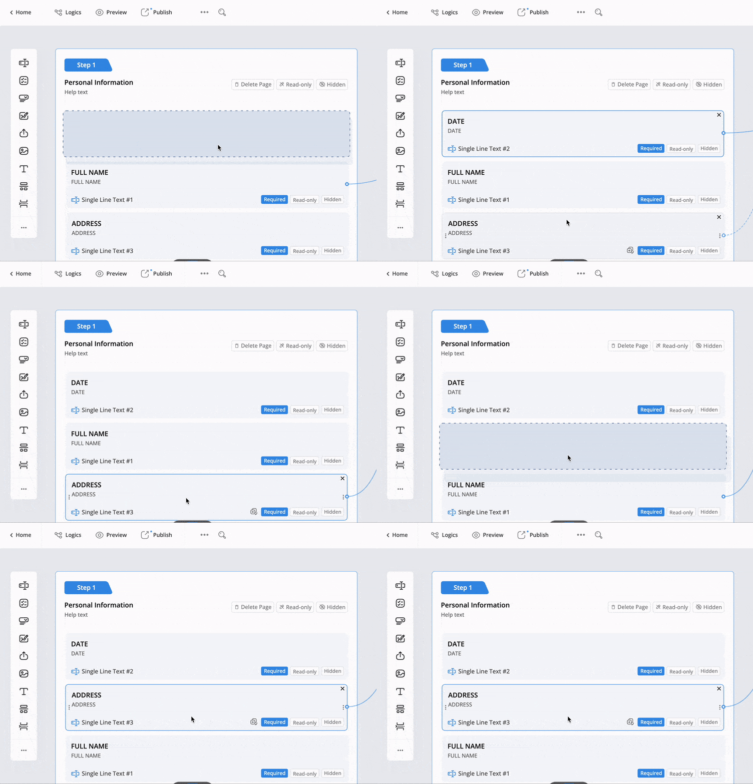
Drag the left or right edges of a field widget to adjust its length and position.
Edit a single field
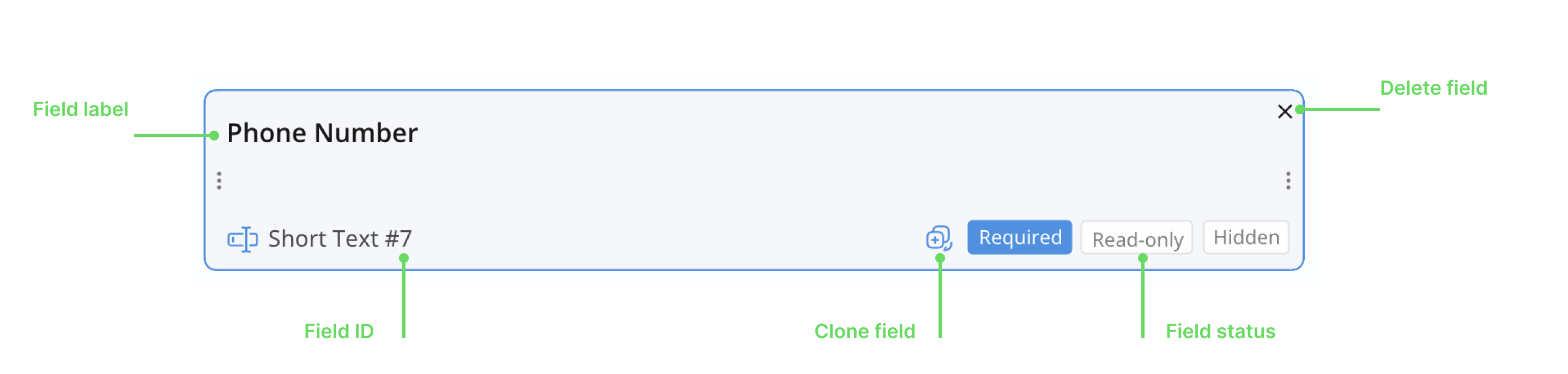
Each field is enclosed within a widget. When you hover over a specific field, the field widget will be highlighted. Here’s what you can do:
-
Click the Field Label or Field ID to open and edit its attributes.
-
Click the X icon in the upper right corner of the widget to delete it.
-
In the lower right corner of the widget, set the field status by choosing
Required,Disabled, orHidden. -
To clone this field, hover to the left of the Required button and click the Clone button.